I’ve reached stage four of my beginning oil painting class: the color course.
The following pictures were taken over two successive three-hour classes. I’ve had to slow down as we move into the world of color.
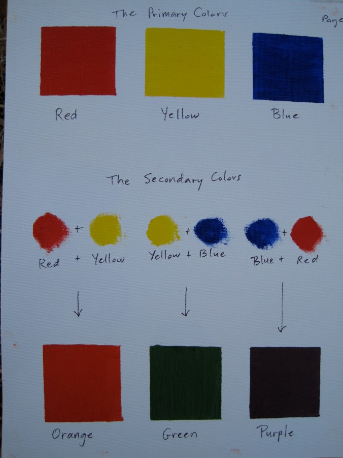
The first step was to take a look at the primary colors I had in my tubes of paint, and then to mix their secondary colors.
This isn’t a completely faithful image of the painting, but it’s close enough that you can see that “true” orange is a little redder than we imagine, true green a little darker, and true purple a lot darker.
Next I made a patch of paint for every tube color I have, minus the white. This is so that I have my limited palette on one page. As a beginner, it’s best that I not start with too many colors before I’ve learned to master a few.
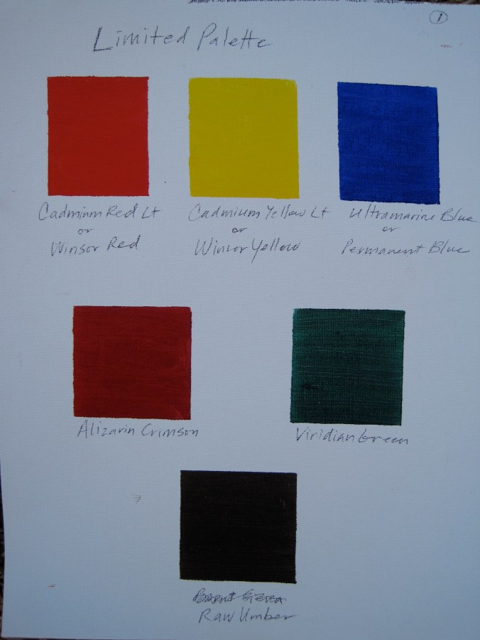 The raw umber is the tube color I used to do all of my tone paintings. It’s a very brown color, and it’s still weird to me how it turns gray once you add the opaque white to it.
Next I created a primitive color wheel.
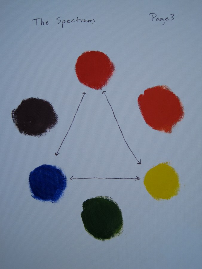 Again, this is not a completely faithful image, but you can still see how close to red the orange is.
Now a color wheel with more gradations:
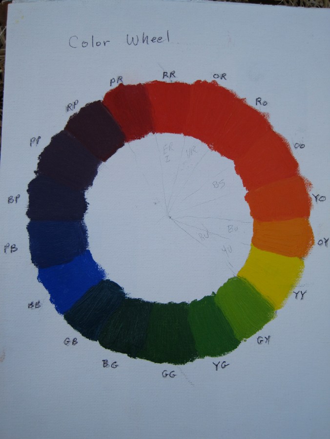 The letters on the outside are an abbreviation of the color represented. GG is true green, YG is yellow green, GY is green yellow, YY is true yellow, etc. When you start from a true color, going one direction will give you the warmer version and going the other will give you the cooler version of the color. There are three kinds of yellow here. Look at how different they are. The three reds, on the other hand, look pretty close to each other.
If you look directly across the circle from a color you get its complement. Now I never understood the purpose of complementary colors except to find the two colors that look most hideous next to each other, say blue and orange.
As it turns out, they serve a purpose in oil painting. Here it is:
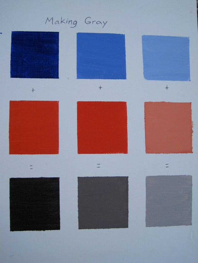 If we add two complementary colors to each other in equal amounts, they neutralize each other. Where this is useful in painting is to dull down the brightness of the original color to make it look like a color we actually see on earth. Above you see the (almost) perfectly neutral gray. As you head toward the center of the color wheel, the orange would get duller and duller until it hit gray, and then would cross the center to become a dull blue that brightened and brightened until it hit true blue on the other side. In the exact center of the wheel is gray.
To get earthy tones, we add complementary colors.
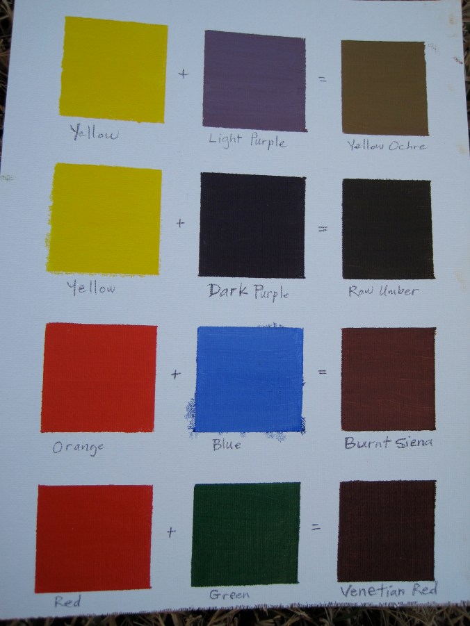 On the top, a light purple added to its complement, yellow, gets us a dull yellow called yellow ochre. If we add a dark purple instead, we get a really dull yellow called raw umber — one that perfectly matches what I got out of a tube. Burnt Siena is simply a dulled-down orange, and Venetian Red is a dulled-down red. Every one of these is dulled with its complement.
I started work this week on a simple painting of an apple on a neutral gray cloth. I’m finding it very challenging to capture the dynamic of color flow, but it’s a lot of fun. I hope to show you more soon.
Categories: Art
Tags: art, beginning oil painting, color, oil painting

